Color Spaces, Explained — sRGB, Rec.709, Rec.2020, and DCI-P3
Color space is one of those terms that floats through camera specs, monitor reviews, and delivery requirements without ever getting fully explained. You've seen the labels — Rec.709, sRGB, DCI-P3, Rec.2020 — and you may know that "wider is better" in some vague sense. But what exactly is a color space, and why does choosing the wrong one wreck a perfectly graded shot?
Here's the complete picture.
What a Color Space Actually Is
A color space is a defined set of colors — a bounded region carved out of the full visible spectrum of human vision — combined with rules for how those colors are encoded as numbers.
Three things define a color space:
| Component | What it defines |
|---|---|
| Primaries | The red, green, and blue corner points that form the gamut triangle |
| White point | Which shade of "white" is the reference (e.g., D65 daylight) |
| Transfer function | How linear light values are mapped to code values (the gamma curve) |
Change any one of these and you have a different color space. The confusion in practice comes from people using "color space" to mean just the gamut, just the gamma, or both at once. Technically, the full combination of primaries + white point + transfer function is called a color encoding specification. In everyday production talk, "color space" covers all of it.
The Visible Gamut vs. the Recorded Gamut
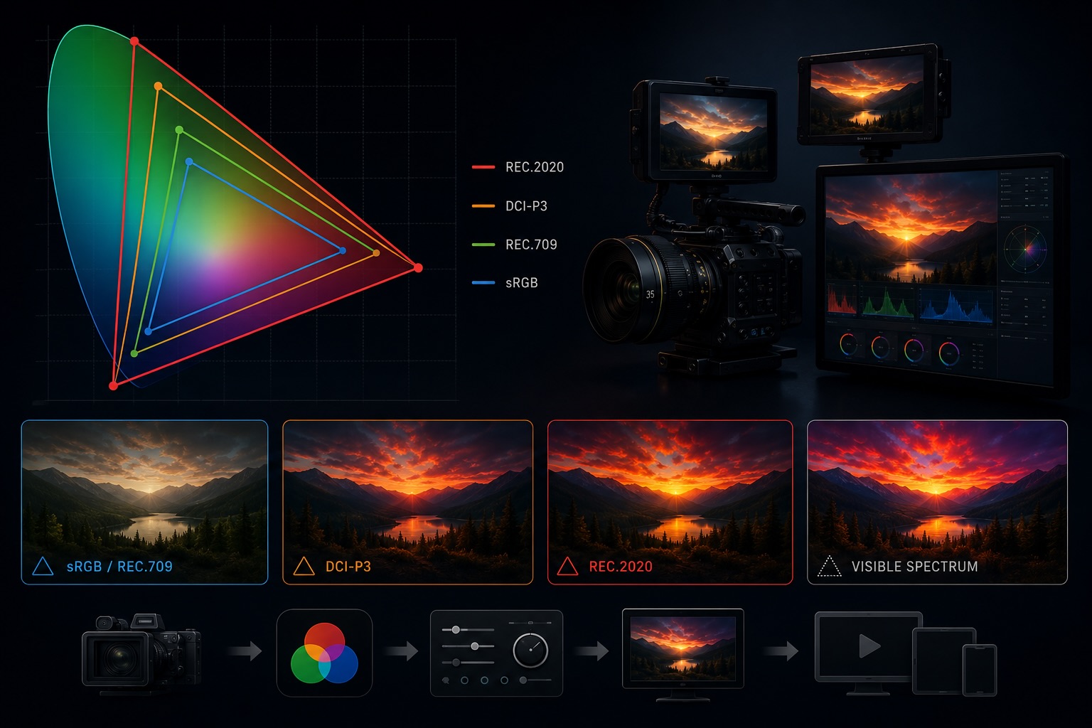
A useful mental model: imagine all colors human eyes can see plotted as a horseshoe-shaped region — the CIE 1931 chromaticity diagram. Any color space defines a triangle within that horseshoe. Colors inside the triangle can be represented. Colors outside cannot.
- sRGB / Rec.709 covers about 35% of visible color
- DCI-P3 covers about 53% of visible color
- Rec.2020 covers about 75% of visible color
"Wide gamut" means the triangle is bigger — more of the horseshoe fits inside the spec. The practical consequence: a sunset that a wide-gamut camera can faithfully capture might clip to muddy orange if it lands in a Rec.709 pipeline.
sRGB — The Web and Consumer Standard
sRGB is the color space of the internet, standard consumer monitors, and most JPEG/PNG images. It was developed jointly by HP and Microsoft in 1996 to give web content a consistent appearance across devices.
sRGB and Rec.709 share the same primaries and white point (D65) — they define the same gamut triangle. The difference is their transfer function: sRGB uses a piecewise gamma closer to 2.2, while Rec.709 specifies a gamma of 2.4 (though many displays and tools treat them interchangeably).
For video purposes, the practical rule is: content meant for the web or general consumer display lives in sRGB/Rec.709 space. Monitors shipped to the mass market since the mid-2000s are calibrated to this standard.
Rec.709 — HD Broadcast
Rec.709 (formally ITU-R BT.709) is the color standard for HD television — 1080p broadcasts, Blu-ray, most streaming delivery specs.
Same gamut as sRGB, but Rec.709 gamma is typically calibrated to 2.4 in a dark viewing environment (a dim room, not the bright office a monitor reviewer would test in). Most camera manufacturers, NLEs, and delivery pipelines default to Rec.709 when they don't specify otherwise.
If you're shooting HD video for general distribution, Rec.709 is your target color space. It's not exciting — it doesn't cover particularly vivid blues or greens — but it's what every HD television on the planet knows how to display without any conversion.
Camera-native Log vs. Rec.709
When a camera shoots in a "log" profile (S-Log3, Log-C, BRAW, etc.), it's intentionally not shooting Rec.709. Log footage is a linear-ish capture designed for grading, not display. It looks flat and desaturated on a monitor because it was never meant to be displayed raw.
The grading step — applying a LUT or a manual grade — is precisely the act of converting from camera-native log into a delivery color space, typically Rec.709 or P3. See the companion post on log gamma for the full workflow.
DCI-P3 — Cinema
DCI-P3 is the color space used in digital cinema projection, defined by the Digital Cinema Initiatives consortium (Disney, Fox, MGM, Paramount, Sony, Universal, Warner Bros.) in 2005.
P3 covers a significantly wider gamut than Rec.709, particularly in greens and reds. It was designed to match what film projectors could actually show — a target wider than what consumer displays of the era could handle.
P3 matters for video producers in two contexts:
- Theatrical delivery — any film going to a DCP (Digital Cinema Package) must be graded and delivered in DCI-P3.
- Consumer HDR — Apple's "Display P3" (used on every iPhone, iPad, and Mac since 2016) is essentially DCI-P3 with the Rec.709/sRGB white point instead of DCI's green-ish D63. When you're mastering for Apple platforms, Display P3 is often the target.
P3 is the color space where consumer electronics and professional cinema have started to converge. If you're delivering to any modern Apple device, wide-gamut Android screen, or a streaming service that supports HDR10, your footage may be displayed in P3 or wider.
Rec.2020 — Ultra HD and HDR
Rec.2020 (ITU-R BT.2020) is the color standard for UHD (4K/8K) and HDR content. Its gamut is enormous — covering colors that existing cameras and displays can't fully reproduce yet.
That last sentence is important: no mainstream camera or display as of today is fully Rec.2020. Even the best cinema cameras capture roughly 80–90% of Rec.2020. The spec was defined ahead of the hardware to give the industry a long-horizon target.
Rec.2020 is the container color space for HDR formats like HDR10 and HLG — the data says "this is Rec.2020," but the actual captured gamut is narrower. As displays improve over the coming years, the same Rec.2020-encoded file will look better on better hardware without needing re-encoding.
For most working videographers today, Rec.2020 means: tag it correctly when delivering HDR, but don't assume your camera captured the full gamut.
How Color Spaces Are Stored in Metadata
Color space is not embedded in raw pixel data — it's declared in the container and codec metadata. A player that doesn't read the declaration makes an assumption (usually Rec.709), which can cause color shifts when the actual content is P3 or Rec.2020.
| Container / Codec | Where color space is stored |
|---|---|
| H.264 / H.265 | VUI (Video Usability Information) in the bitstream |
| ProRes / DNxHD | Container-level color primaries atom |
| MKV | Colour element block |
| MP4 / MOV | colr box in the video track |
The VUI / colr box stores three separate IDs:
- Color primaries — which gamut (Rec.709, P3, Rec.2020)
- Transfer characteristics — which gamma/EOTF
- Matrix coefficients — how to convert between RGB and YCbCr
If any of these are missing or set to "unspecified," the player guesses — usually Rec.709. This is why footage that looks saturated and shifted when opened in certain players often just has missing color metadata, not a wrong capture.
A quick ffprobe run reveals all three:
Stream #0:0: Video: hevc
  Color Range: tv
  Color Space: bt709
  Color Transfer: bt709
  Color Primaries: bt709
If the camera shot in a log profile but the metadata wasn't updated at export, you might see "bt709" declared on footage that's actually S-Log3 — which will confuse any player that applies automatic display transforms.
Choosing a Color Space for Your Project
The right color space depends entirely on what the footage needs to survive:
| Delivery target | Color space |
|---|---|
| Web / YouTube / standard streaming | Rec.709 |
| Apple devices, iPhone, Mac | Display P3 (if HDR or wide-gamut aware app) |
| Theatrical / DCP | DCI-P3 |
| HDR streaming (HDR10, HLG) | Rec.2020 container, correctly tagged |
| Archive / grading master | Camera native log — widest recorded data |
The most common mistake: grading for a wider space and delivering to a narrower display without converting. P3 footage on a Rec.709 display looks over-saturated because the wider gamut values are being clipped or compressed. Conversion — not just tagging — is required.
Equally common in the other direction: delivering log footage with a Rec.709 declaration. It looks washed-out because the gamma expansion was never applied.
Why Color Space Tags Matter in Your Library
Incorrect color space metadata propagates downstream. An edit assembled from clips with inconsistent or wrong color declarations will behave differently in every tool that reads them — NLE, grading panel, streaming encoder, quality-control suite.
When VideoTagger indexes a library, it reads and surfaces the color space declaration from each clip: primaries, transfer function, and matrix coefficients. This makes it possible to:
- Identify clips tagged "Rec.709" that were actually shot in log — a sign of a botched export
- Separate archive camera-native files from already-graded deliverables
- Flag Rec.2020 HDR content before it hits a Rec.709-only pipeline
- Build smart filters across a multi-project library by intended delivery spec
Color space is as foundational as codec or resolution — and just as easy to get wrong. Keeping it searchable is the first step to keeping it correct.
Summary
- A color space defines a gamut (which colors), a white point, and a transfer function (how they're encoded as numbers)
- sRGB / Rec.709 covers standard HD — the baseline for almost all non-HDR delivery
- DCI-P3 is cinema and modern consumer screens — significantly wider greens and reds
- Rec.2020 is the UHD/HDR target — wider than any current camera fully captures
- Color space is declared in container metadata, not embedded in pixels — a wrong tag means wrong display, not wrong capture
- Matching your color space declaration to your actual content is as important as choosing the right one in the first place
Related articles
HDR, Explained — HDR10, Dolby Vision, HLG, and What "High Dynamic Range" Actually Means
HDR is sold as "brighter, more vivid" — but that marketing hides what's really going on. Here's what dynamic range actually is, why HDR needs PQ or HLG curves and 10-bit color, and how HDR10, Dolby Vision, and HLG differ in one sitting.
Video Aspect Ratios, Explained — From 4:3 Television to 2.39:1 Anamorphic
16:9, 2.39:1, 9:16, 4:3, 1.85:1 — each ratio carries history, intent, and a specific look. Here's what every common aspect ratio means, where it came from, and how to choose between them.
Shutter Angle, Explained — The 180° Rule and How Motion Feels in Video
You bumped the shutter speed to 1/1000 the way you would for a photo, and now the footage looks stuttery on playback. In video, shutter doesn't control brightness — it controls how motion reads. Here's shutter angle, the 180° rule, and frame rate, in one sitting.